Banking As It Should Be
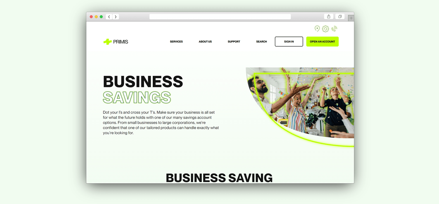
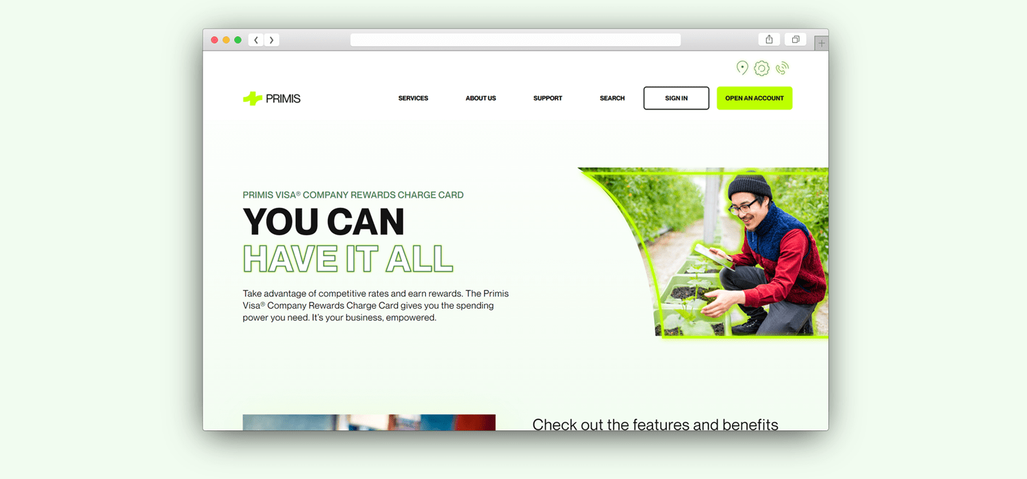
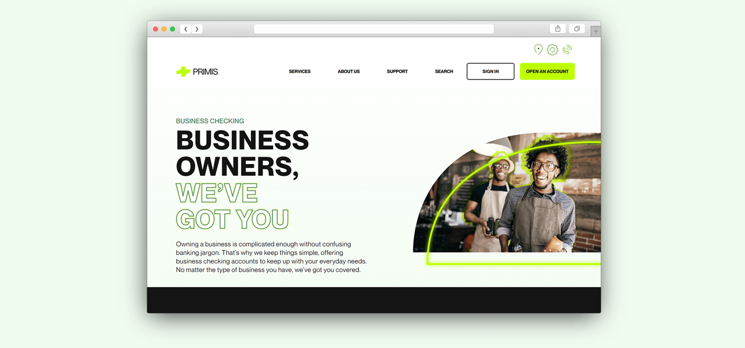
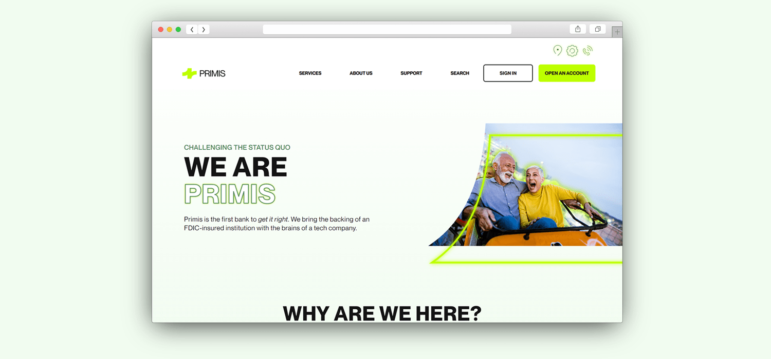
Primis does not want to be mistaken for your average bank. Their mission is to break the mold of the conventional industry banking model by creating a more fun, energetic and personalized experience for their customers. In order to achieve this approach, our team gave their existing brand an uplift with a more fearless take on a bank.
Visit the website at Primisbank.com
CLIENT
Primis Bank
SCOPE
Branding
UI Design
UX Design
ROLE
Branding
UI Design
UX Design

UX Process
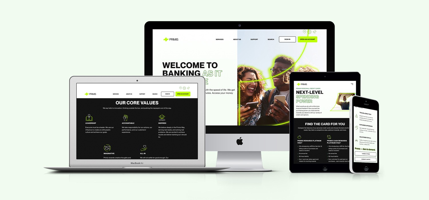
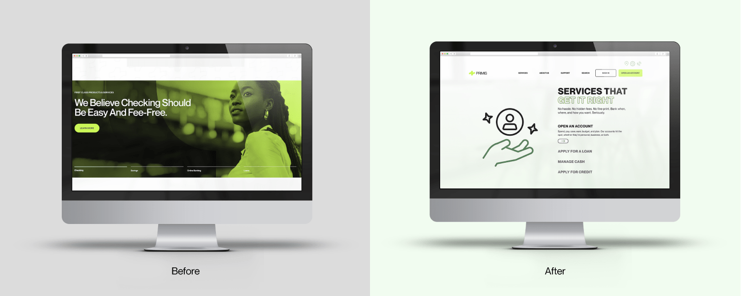
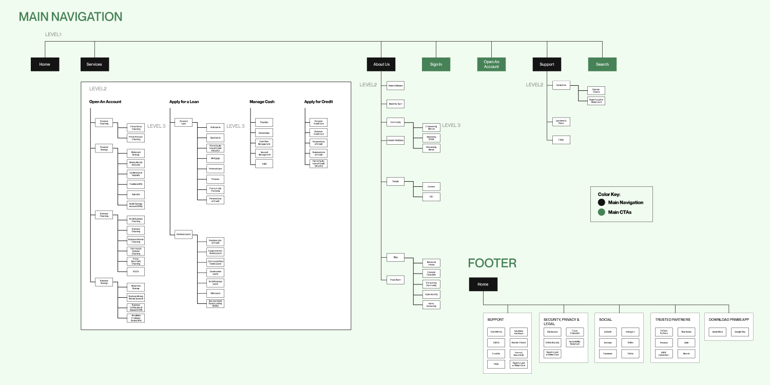
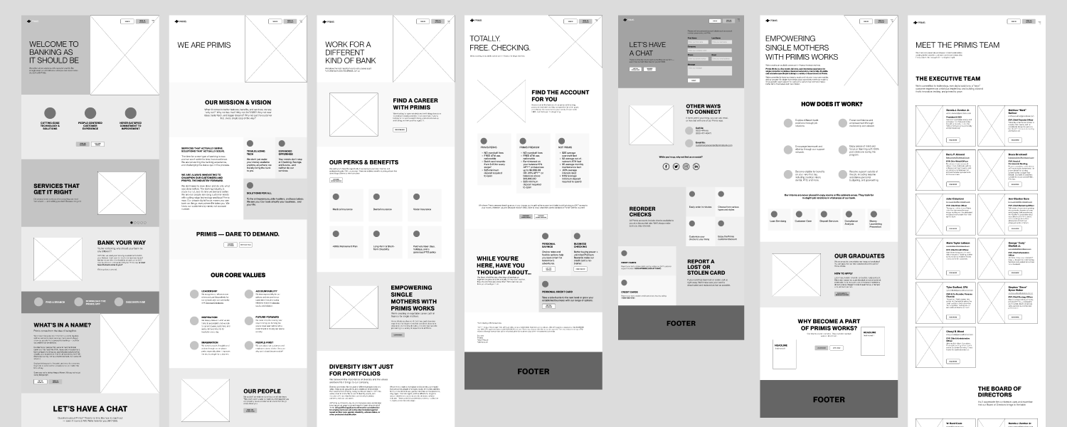
Our team did a comprehensive dive into the pages of the initial version of the website and identified what pages were the most important and which ones could be consolidated. Through this process we were able to significantly reduce the amount of pages on the site and put a real focus into what content mattered most. Our team took a component first approach to the design, creating 15 components to be used interchangeably throughout the site. This provided a consistent visual language and streamlined process for our development team.


Refine and Expand
The initial Primis brand color palette was bright neon green and a gradient of black and grays. The Primis brand had established the neon green and branded black as their primary colors, so I eliminated the majority of the grays and replaced them with a spectrum of greens to complement their neon green. This approach provided the brand a bright, more refined look.
Typography
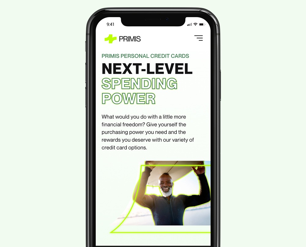
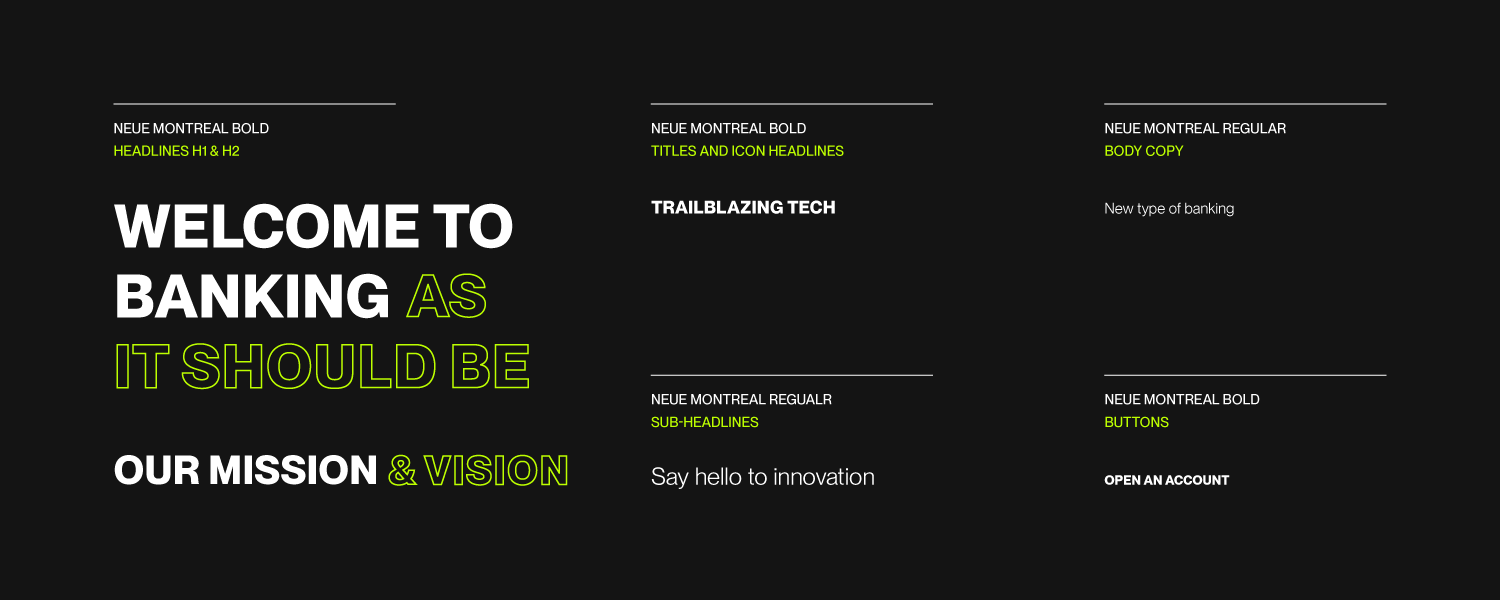
For the brand typography, I kept the initial typeface of Neue Montreal. I noticed not many banks were utilizing outlined fonts and I thought this would be a great choice to give the Primis brand the punch it needed to stand out. I used contrasting background and font colors in the headers to make the words glow and feel more energetic.

Building Consistency
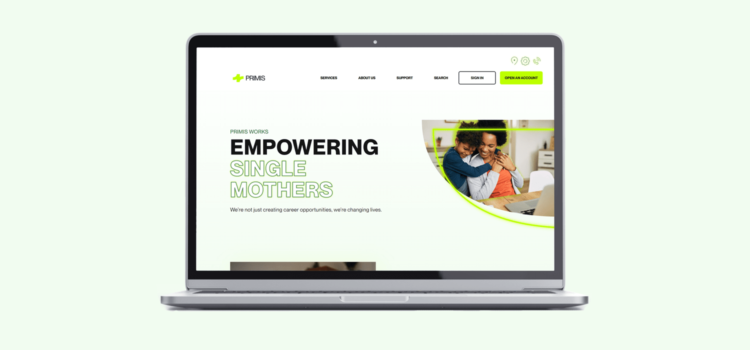
To give the Primis brand more elements to work with and expand its design system, I took the four areas of negative space of the Primis identity and turned them into four containers to be used as interchangeable hero images throughout the website. This created brand consistency and visual cohesion. I then added a neon glow offset outline of the same container shape to create visual interest and to further enforce the neon glow theme across the site.
Icon Library
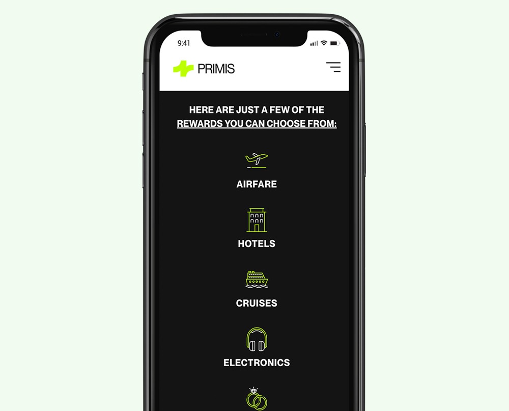
Developing the icon library was a lot of fun. This was a great way for Primis to stand out among its competitors and have its visual voice shine. I wanted the iconography to be fun and creative while visually assisting the user in understanding the content. Similar to the typography, I utilized the neon green outline on black and a background glow on white.
Purpose Driven Work
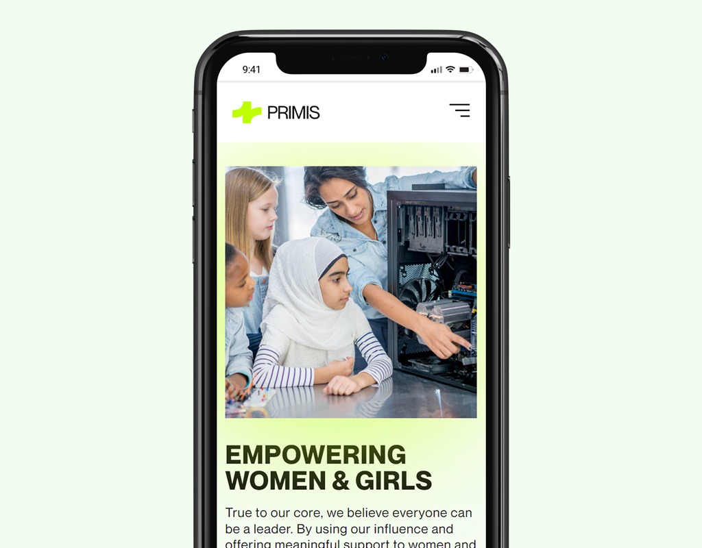
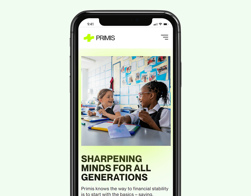
Primis is a purpose-driven bank that supports communities in need by supporting single mothers, young girls and youth to create better opportunities through financial literacy.
Special Thanks
Thank you to the whole Primis and Look Listen team; this was one of my biggest website projects and I am very proud of the final product. My team was extremely supportive and provided helpful guidance through the whole project. It was a special experience collaborating with the development team on ways to bring in micro-interaction animations to make this website the best it could be.


