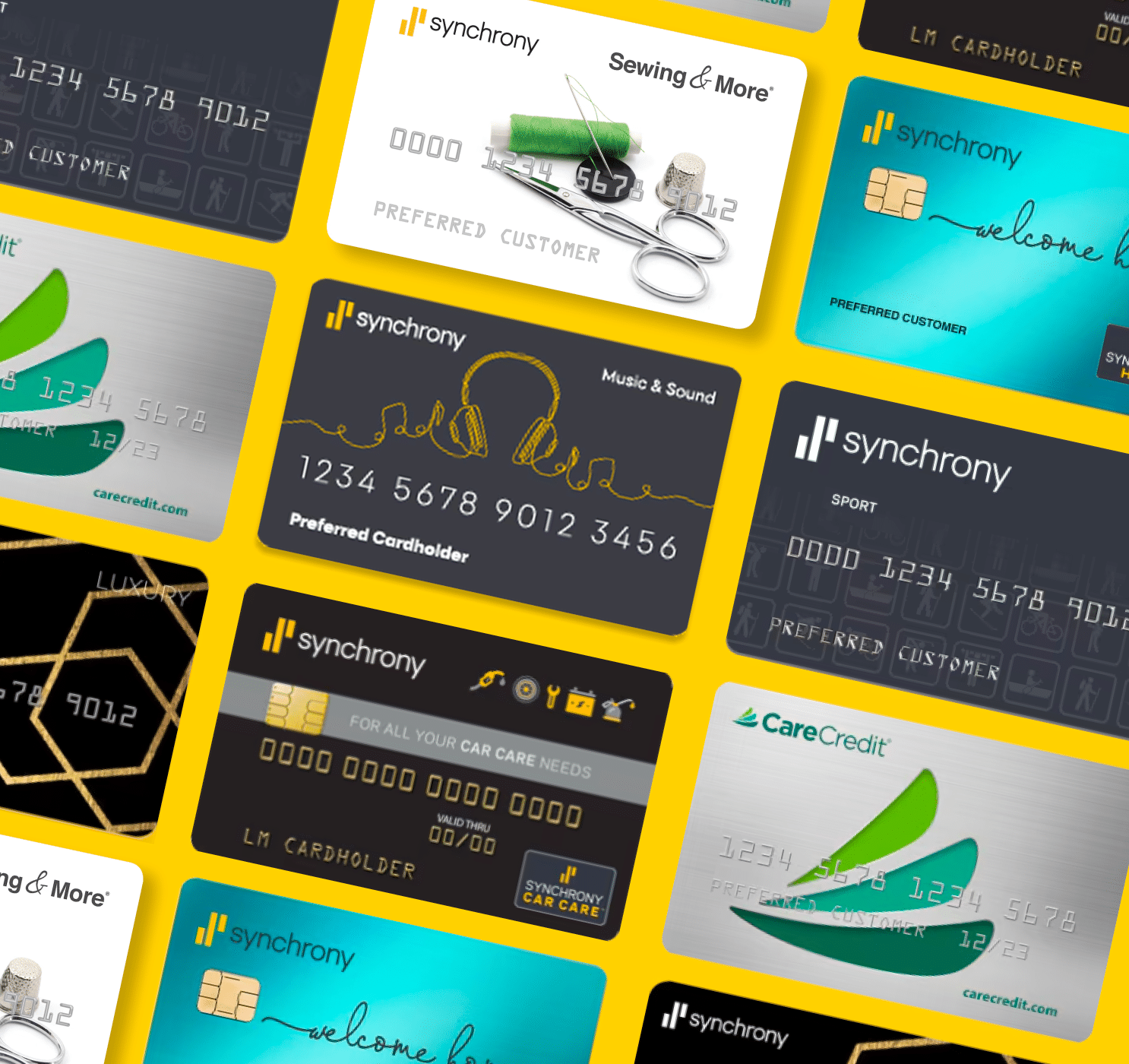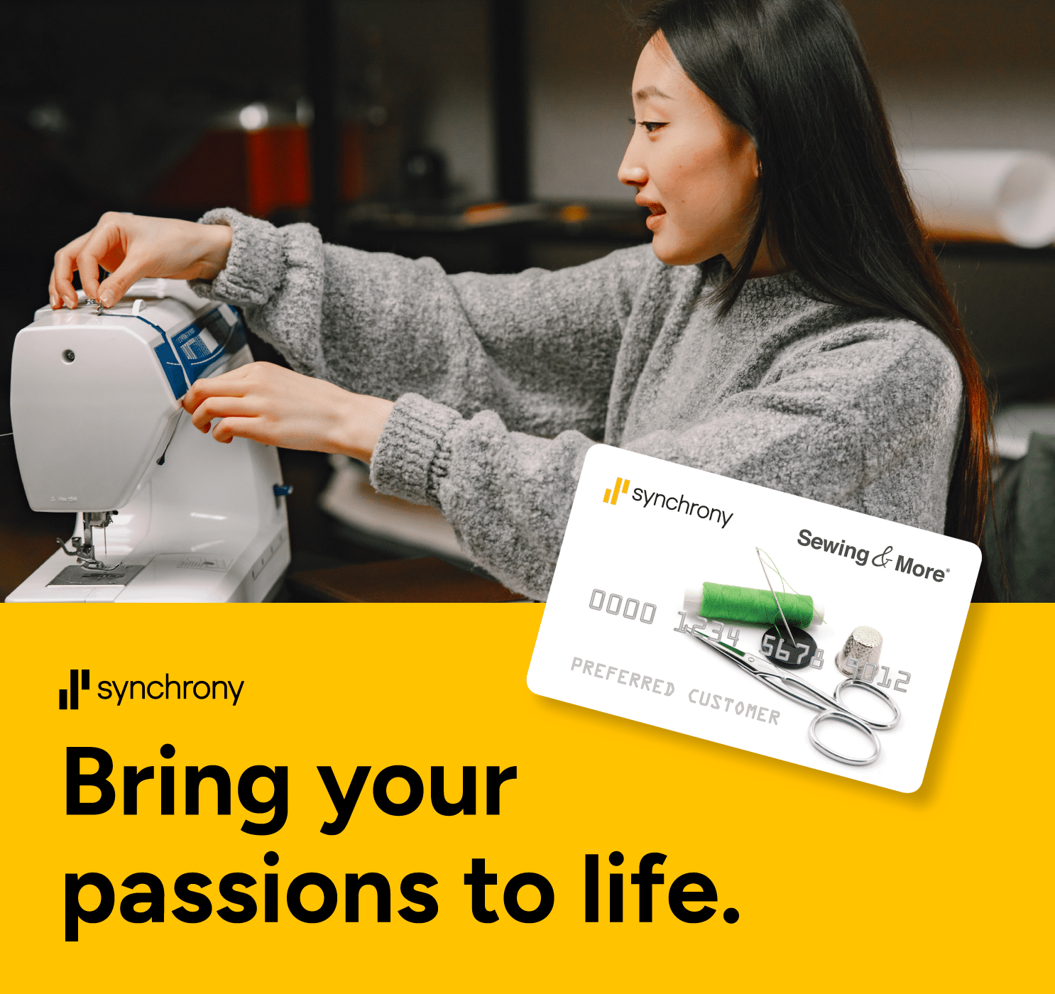


Credit With A Destination
The Challenge
Synchrony powers credit at hundreds of retail, health, home, and auto brands, but its Marketplace had a discovery problem. Cardholders had to know where to look, offers were hard to scan, and the path from “interesting deal” to “I know how to use my card here” wasn’t clear.
The Solution
Our team redesigned the Marketplace around how people actually look for deals: by category, brand, or search. Scannable deal cards, one-click brand modals, and image-led network cards, all built as one scalable Figma system, made the path from deal to action clear.
My Role
I owned the Marketplace UX and UI end to end, from structuring user journeys to designing components. I pitched direction to senior stakeholders and built Figma prototypes quickly to pressure-test ideas before development.
The Results
Coming Soon
Client
Synchrony
Scope
UX Strategy
UI Design
Component Design
Design System
Rapid Prototyping

UX Foundation
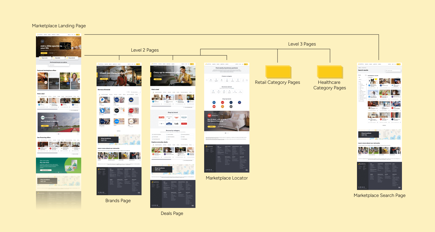
Marketplace visitors arrive with different intents: browsing a category, hunting for a specific brand, or checking a deal they heard about. I mapped these journeys and built the experience around three entry points: browse by category, browse by brand, and search.
An Identity with Flavor
The logo centers on a simplified tomato—an iconic symbol of California’s culinary identity and fresh, approachable cooking. Paired with an expressive script wordmark, the identity feels warm, energetic, and distinctly different from the polished, predictable look of traditional cooking schools.

Deal & Offer Cards
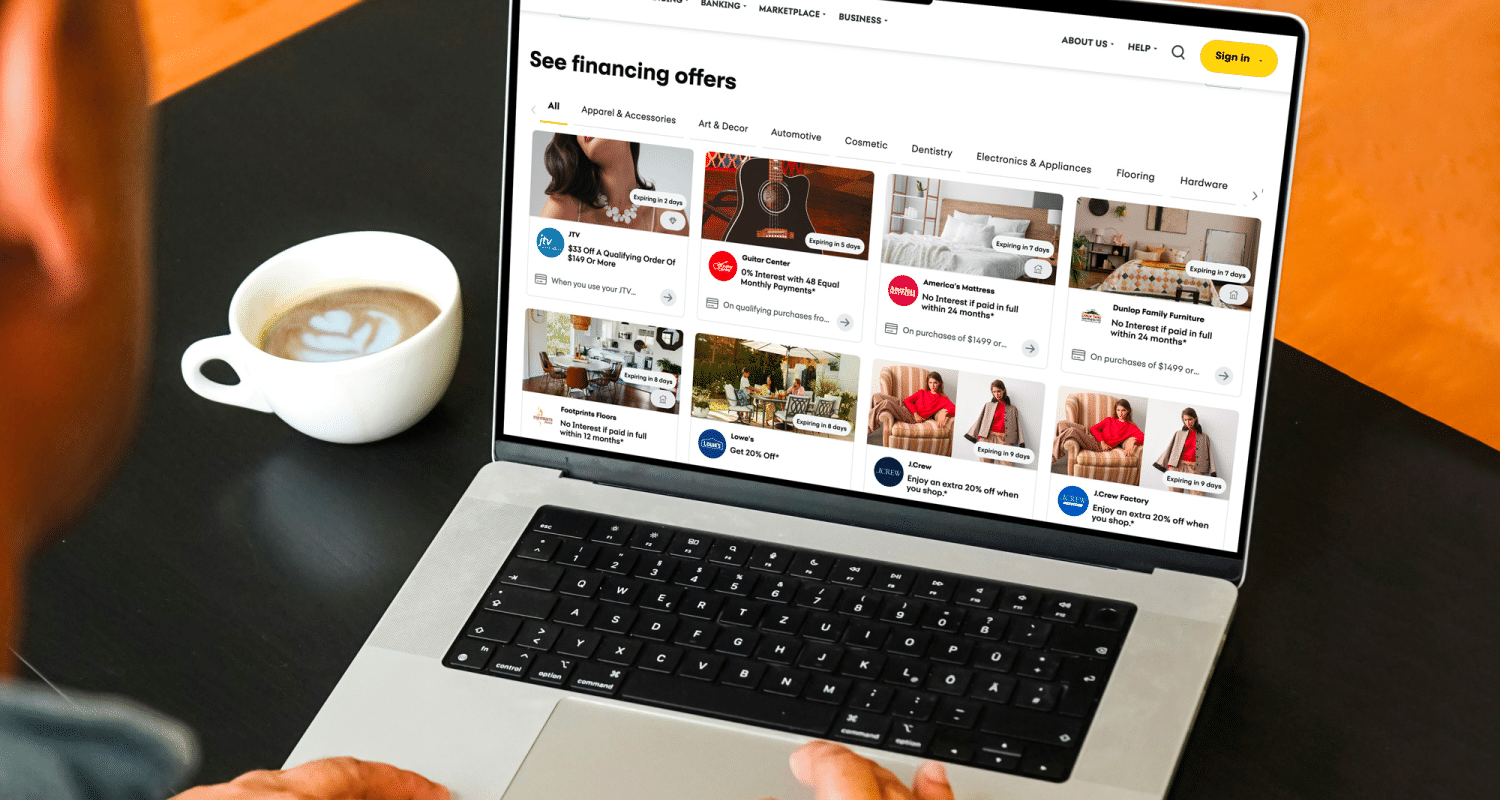
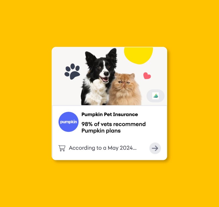
The deal card is the most repeated unit on the Marketplace, so small decisions compound. The card elements (image, logo, headline, sub-headline) all had to work for any partner looking to advertise their deals and offers on Synchrony Marketplace. I redesigned the cards to be scannable in seconds: brand identity first, offer headline second, supporting detail third.
Brand Tiles & Brand Modal
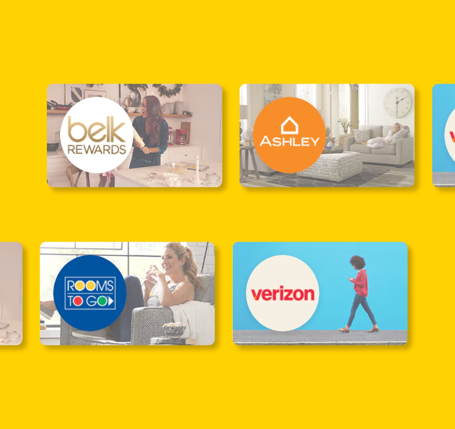
The brand tiles pair a lifestyle image with a circular logo mark, so people can recognize a brand instantly and still feel the context of what they’d buy there. A simple offer count, like “7 offers available,” sets expectations before the click.
Rather than sending users to a new page, the brand modal keeps them in their browsing flow and answers the three questions a cardholder actually has: Can I shop here? Can I apply? Can I manage my account? Each gets one clear action: Shop, Apply now, Sign in.
Network Cards
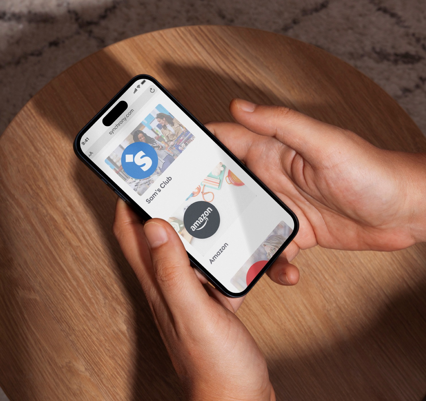
Synchrony’s Network cards each serve a different life moment. The network cards use large, human photography and plain labels to help people self-select into the right card by need, not by product name.